Address
304 North Cardinal
St. Dorchester Center, MA 02124
Work Hours
Monday to Friday: 7AM - 7PM
Weekend: 10AM - 5PM
Address
304 North Cardinal
St. Dorchester Center, MA 02124
Work Hours
Monday to Friday: 7AM - 7PM
Weekend: 10AM - 5PM
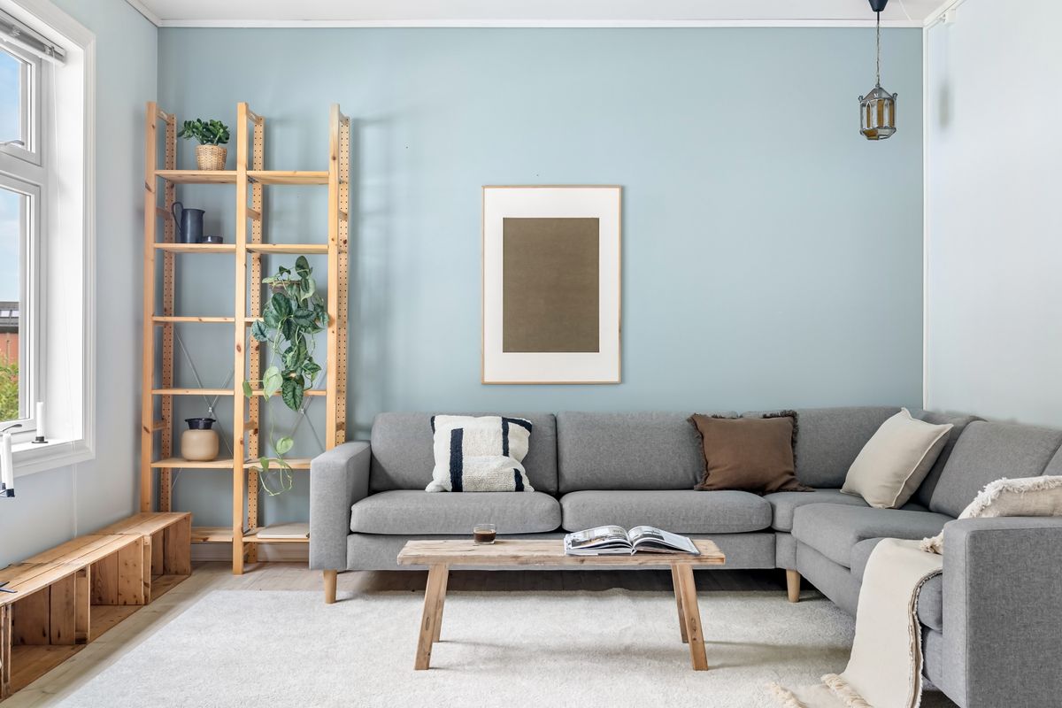
Gallery lighting design is the quiet art of making art, ceramics and the objects you love look their absolute best — while still feeling warm and liveable. It is not about museum-grade glare or cold spots. Done well, it uses narrow art lighting to frame a canvas, soft wall washer light to lift a textured wall, and warm colour temperatures to keep a room cosy. This guide walks through the core gallery lighting principles, the fixtures that do the job, and three real Nordic-home case studies you can copy.
Ordinary lighting asks a simple question: is the room bright enough? Gallery lighting design asks a subtler one: what should the eye notice first? A gallery scheme creates a hierarchy — one hero piece in crisp focus, supporting objects in softer pools, and a gentle ambient layer underneath. In a home, that hierarchy is what turns a wall of everyday prints into a curated, magazine-worthy display.
The Illuminating Engineering Society (IES) recommends between 5–15 foot-candles for most art and well under 50 for general living areas. The trick is contrast: the difference between a bright piece and a dimmer wall is what makes art glow. In a Scandinavian interior full of pale woods and white walls, that contrast does most of the work — no heavy fixtures required.
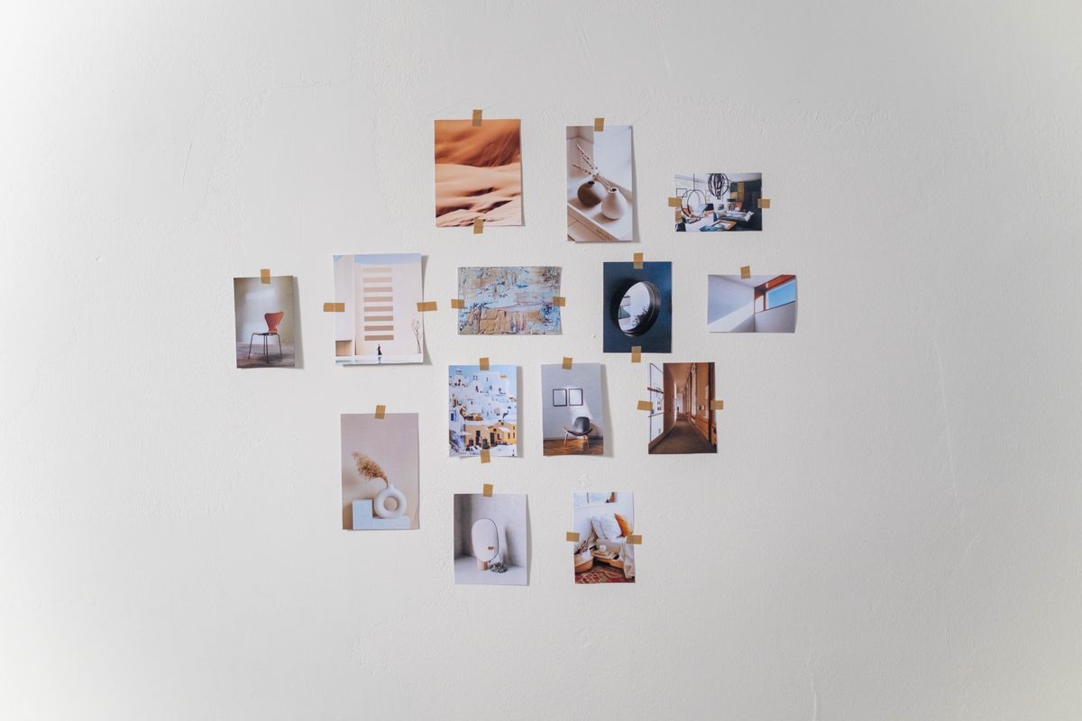
Whether you are lighting a single canvas above a sofa or a full salon wall, six principles keep a scheme balanced, flattering and glare-free.
Narrow track lighting for art — typically a 15° to 24° spot — should aim at the piece, not wash the whole room. Each artwork deserves its own focused pool. This is exactly what adjustable track lighting heads like the AIMER series are built for: you slide each head to its target and fine-tune the aim.
For residential art, 2700K–3000K reads warm and natural without yellowing whites. Learn more in our track lighting color temperature guide. Avoid cool 4000K+ unless you are lighting a clinical, contemporary space.
Colour rendering index (CRI) decides how true the reds, greens and skin tones in your art look. A CRI of 90+ makes oil paintings and photographs sing; CRI below 80 makes them look flat and washed out. See the difference in our CRI 80 vs 90 vs 95 guide.
Never light a room with a single source. Combine a narrow accent spot on the art, a mid beam on the seating area, and a soft wide wash for ambience. This three-layer approach is the heart of good gallery lighting design.
Art should glow, not your visitor. Use fixtures with deep anti-glare optics and aim them so the light hits the artwork while the source stays out of the line of sight.
Art galleries dim heavily at night. Add dimming so the same wall reads bright for reading or soft for a cosy evening. A dimmable LED track system gives you both moods from one set of fixtures.
For a residential gallery wall, three fixture types dominate — and they can all live on one track.
| Fixture | Beam | Best Job | Nordic Home Use |
|---|---|---|---|
| Spot / accent head | 15°–24° | Framing a single artwork or object | Hero canvas above the sofa, a ceramic vase |
| Wall washer | 36°–60° | Washing a textured wall or whole display | Lifting a white brick or plaster gallery wall |
| Picture light / cylinder | Fixed downlight | Even light across a wide frame | A long horizontal print or salon wall |
For a classic home gallery, the zoomable CADIO track light is ideal because a single head can switch from a tight 15° accent to a wide 36° wash as you rearrange your wall. For washing a full textured wall with even, shadow-free light, an ELLA wall washer does the job beautifully. And if you prefer a sleek, low-profile system, a 20mm magnetic track keeps the rail almost invisible so the art stays the star. Whichever you choose, look for ENERGY STAR-certified LED fixtures to keep the display bright, cool and efficient for years.
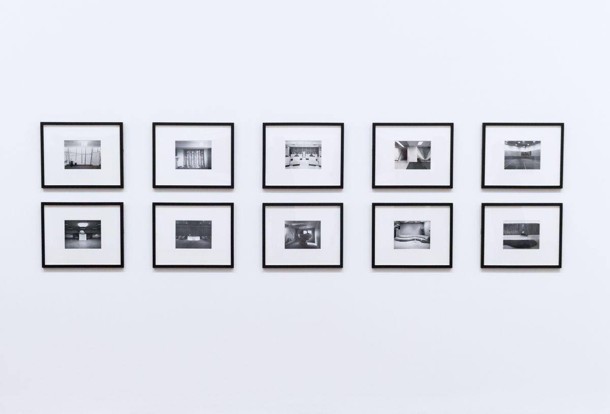
The space: a 4.5 m open-plan living room in Copenhagen with white walls, pale oak floors and a grey linen sofa.
The brief: a 3 m gallery wall of mixed prints, a mirror and one large abstract canvas, lit without visible cables or glare.
The solution: a single 3 m rail with four heads — two 24° spots on the large canvas and mirror, one 15° spot on a small ceramic shelf, and one wall washer lifting the pale wall behind. All at 3000K, dimmed to 70%.
The result is a wall that reads as a single curated composition rather than five separate pictures. Because the heads are individually aimable, rearranging the prints takes seconds — no rewiring, no new holes.
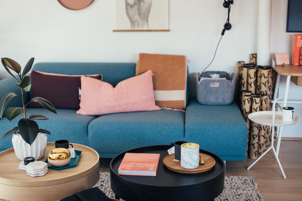
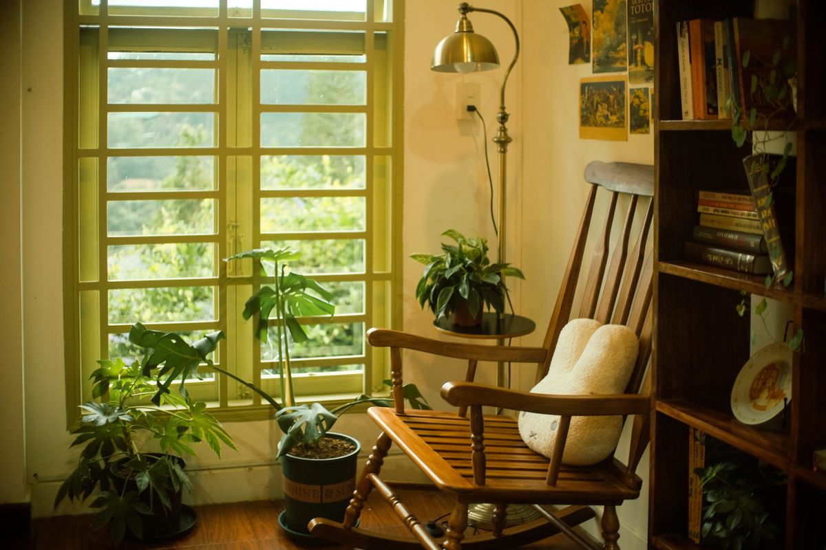
The space: a 2.5 m corner reading nook in a Stockholm apartment with a rocking chair, a plant shelf and a stack of ceramics.
The brief: task light for reading plus a subtle spotlight to make the pottery collection feel museum-quality.
The solution: a 24° head aimed at the chair for comfortable reading, and a 15° accent head on the highest ceramic piece. Both dimmable, at 2700K.
This is the quietest form of gallery lighting design — no grand statement, just three warm pools of light that make the corner feel intentional. The same recipe works over a sideboard, a fireplace mantel or a hallway console.
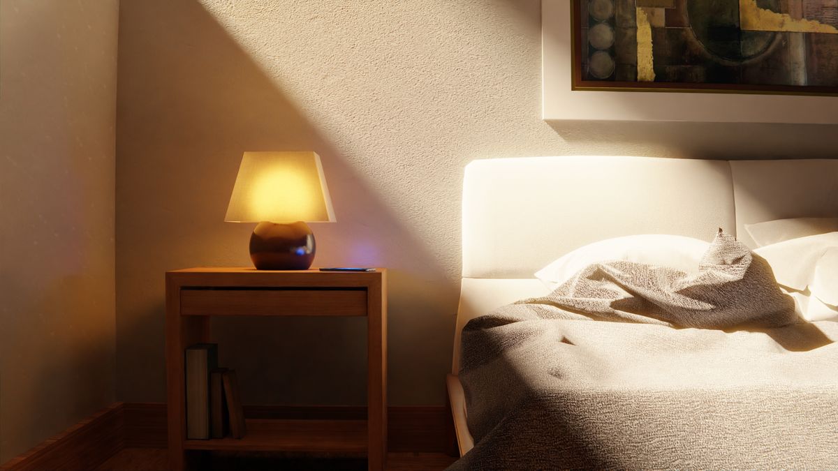
The space: a restful bedroom in Oslo with a headboard wall of three framed botanical prints.
The brief: soft, glare-free accent light that can drop low for a cosy evening and rise for dressing.
The solution: a short rail of two 36° wall-wash heads above the prints, dimmed to 50% by default. Warm 3000K keeps the room calm; a separate bedside lamp handles reading.
Bedroom art lighting should whisper, not announce. A wide, dimmed wash on the headboard wall gives depth without making the room feel like a gallery at night.
If you are unsure which beam pattern suits your wall, revisit our beam angle guide before buying.
For most residential art, 2700K–3000K is best. It renders skin tones and warm pigments naturally without making whites look yellow, and it keeps the room feeling cosy rather than clinical.
A 15°–24° spot is ideal. At a standard ceiling height, a 24° beam creates a pool of roughly 1–1.2 m — perfect for a single canvas or frame — while a 15° beam gives a tighter, more dramatic accent for smaller objects.
Yes. A CRI of 90+ makes colours in paintings, photographs and ceramics look true and rich. Anything below 80 will make the art look flat and slightly grey, especially reds and greens.
Absolutely — this is the recommended approach. Use narrow spots for individual art pieces and a wall washer for texture or a full display wall. Mixing beams on one rail is what creates a layered, gallery-quality effect.
Yes. Dimming lets you drop the art wall to a soft, ambient glow in the evening and raise it for dressing or reading. It is the single easiest way to keep a bedroom calm rather than clinical.
Great gallery lighting design is about restraint and layering — warm colour temperature, high CRI, narrow accents on the hero pieces, soft washes on the walls, and dimmers to set the mood. The fixtures do not need to be loud; in a Nordic home, the quieter the hardware, the more the art sings.
Start with one rail over your largest wall. Add an aimable track lighting head for the hero piece, a zoomable head for flexibility, and an ELLA wall washer for the wall itself. Explore the full track lighting range, and when you are ready, contact our lighting team for a free layout consultation.