Address
304 North Cardinal
St. Dorchester Center, MA 02124
Work Hours
Monday to Friday: 7AM - 7PM
Weekend: 10AM - 5PM
Address
304 North Cardinal
St. Dorchester Center, MA 02124
Work Hours
Monday to Friday: 7AM - 7PM
Weekend: 10AM - 5PM
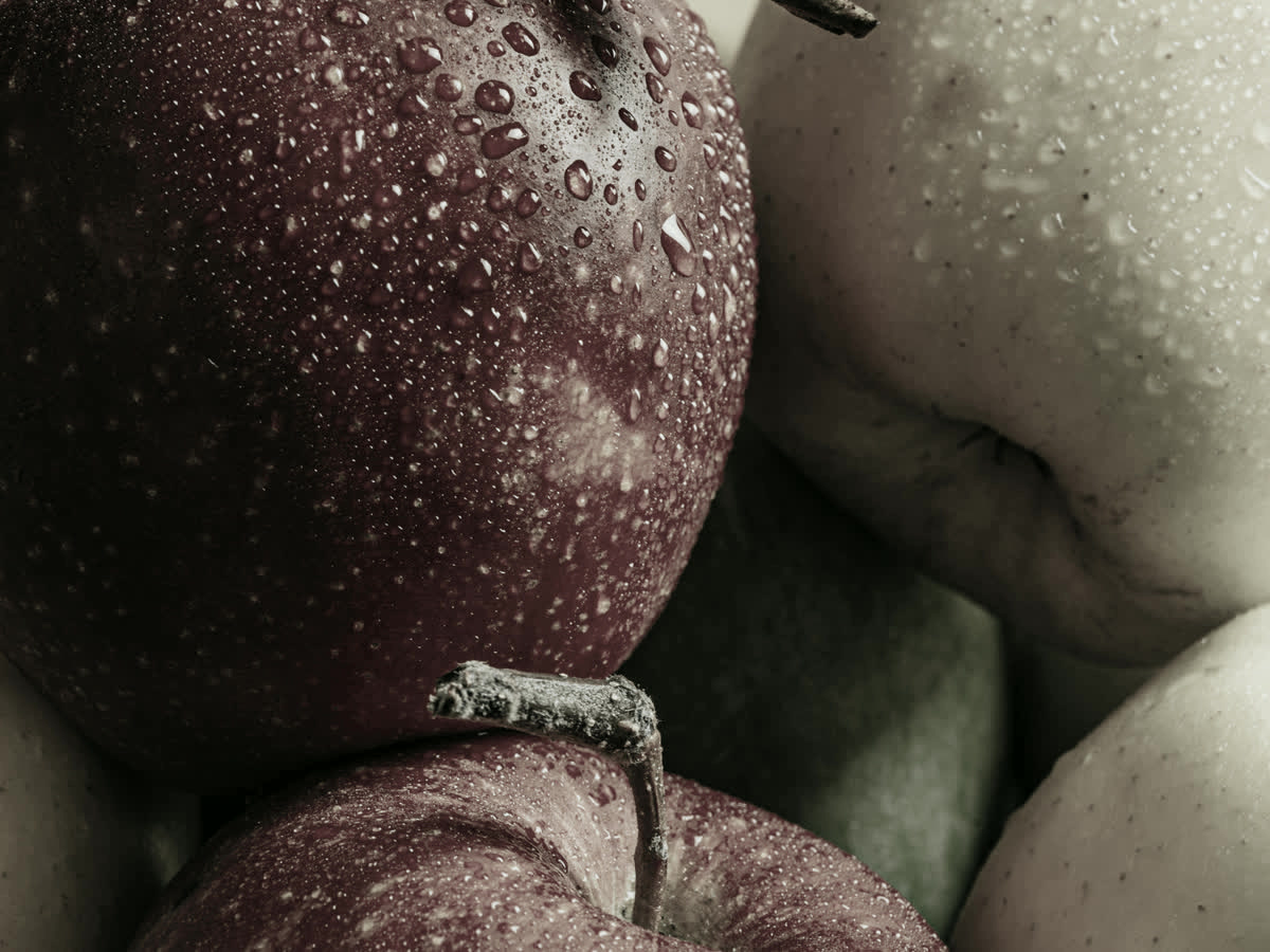
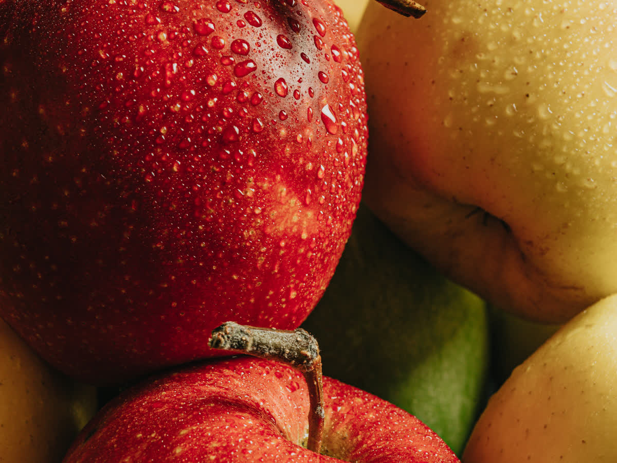
Two identical red apples sit in the same room. Under one light they look deep, glossy and alive; under another they look brownish and dead. Same fruit, same camera, same room. The only thing that changed was a number almost nobody reads on a spec sheet: R9. While the headline Color Rendering Index score (Ra) grabs all the attention, R9 quietly decides whether the reds in your space look red at all — and whether your overall color rendering is rich or merely passable. This guide unpacks what R9 actually measures, why R9 90 vs R9 50 is the single most useful comparison in LED specification, and how to build high-R9 LED lighting that keeps saturated colour honest.
CRI is built from fourteen test color samples, labelled R1 to R14. Each one represents a different hue, and each one is scored from 0 to 100 for how faithfully a light source reproduces it.
Here is the catch that the industry tolerates but rarely advertises: the headline CRI figure you see on a box — Ra — is the average of only the first eight samples, R1 through R8. Those eight are all muted, low-saturation pastels: dusty pinks, olive greens, pale blues. They are deliberately gentle.
R9 is one of the six samples left out of that average. It is the saturated red sample — and it is excluded from Ra entirely. So a fixture can advertise “CRI 90” while its R9 sits at 15. The averaged number stays respectable, the datasheet stays clean, and the reds in your room quietly turn to mud. This is why R9 is the number that makes red look red, and why a single CRI value was never enough to describe color quality.
Producing a deep, saturated red is genuinely difficult for a light-emitting diode, and the reason is physical rather than commercial.
Nearly all white LEDs are really blue LEDs. A blue die excites a phosphor coating, and the phosphor re-emits light across the rest of the spectrum to make the result look white. That conversion works beautifully at the blue and green end. At the deep red end, around 620 to 660 nanometres, phosphor conversion is inefficient and costly — so cheap fixtures simply leave a dip in the red region, and that dip is what R9 detects.
Better LEDs use a red phosphor or an added red emitter to fill that gap. It costs more, so budget products skip it. The result is a market full of fixtures that claim “high CRI” while running R9 values in the 10 to 40 range. A low R9 is a decision someone made to hit a price, not something LEDs are doomed to do.
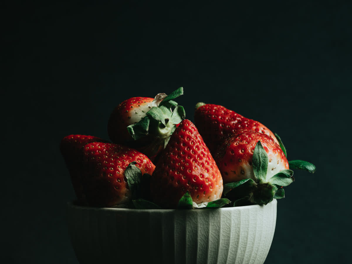
Wood floors lose their warmth and read gray. Leather turns flat and plastic-looking. Ripe tomatoes appear dull. Cosmetics and food photography become almost impossible to correct in post. Perhaps most visibly of all, human skin loses its natural flush — faces look pale, sallow or faintly lifeless, because a huge part of healthy skin color lives in exactly the wavelengths a weak red channel cannot emit.
If you read only one line of an LED datasheet, make it the R9 value. The table below shows what each tier of R9 actually delivers in a real room, and who should care.
| R9 Value | What Red Looks Like | Typical Products | Who Should Accept It |
|---|---|---|---|
| R9 0–20 | Reds go brown or gray; wood and skin look dead | Bargain-basement panels, some unbranded spots | Nobody who cares about the room |
| R9 20–50 | Reds present but muted and slightly dirty | Many “CRI 90” fixtures at mainstream price points | Corridors, car parks, storage, back-of-house |
| R9 50–70 | Solid red, acceptable warmth, no obvious dullness | Good-quality commercial track and downlights | Offices, hospitality, general residential |
| R9 70–85 | Rich saturated red; skin tones read healthy | Specifier-grade architectural fixtures | Retail, salons, restaurants, hotels, homes |
| R9 85–100 | Deep, true, gallery-grade red | High-end and color-critical fixtures | Galleries, museums, photography, premium retail |
The practical headline is this: R9 90 vs R9 50 is a far bigger visible difference than CRI 95 vs CRI 90 ever will be. Moving from R9 50 to R9 90 transforms how a space reads. Moving the averaged CRI number by the same five points barely registers. If you are weighing where to spend, spend on R9.
It is worth noting how much of this story the headline metric hides. Our CRI 90 vs 95 comparison shows how thin the 90-to-95 gap looks in practice, and the CRI vs TM-30 breakdown shows what modern metrics do about it. R9 is the fastest, cheapest proxy you have.
R9 is not only a red metric. It behaves like the saturation control for the whole room, and the link runs through a well-documented lighting phenomenon.
Under dim, warm light the human eye shifts its sensitivity, and cool colors appear to lose saturation while reds stay comparatively strong. When R9 is low, though, there is no red strength to hold on to — so the eye’s natural shift leaves everything looking gray and lifeless. A high R9 value counteracts this drift and keeps the room feeling saturated even after the lights are dimmed.
Color consistency is measured in MacAdam steps (SDCM). One step is roughly the threshold of a just-noticeable color difference. Fixtures held to 2–3 steps look identical head to head. Poor consistency adds a visible cast on top of a weak red channel, which is the combination that makes cheap installations look uneven and slightly dirty.
Your visual system constantly re-calibrates for the color of the light around you, which is why a room does not look orange under a 2700K lamp. Perfect adaptation would just about make up for a low R9. It does not, because the eye adapts fully to broad shifts in white point but only partly corrects for a narrow, missing slice of the spectrum. That is precisely what a low R9 is: a hole the eye cannot patch.
Vendors are not required to publish R9, which is exactly why the ones that do are the ones worth buying from. Here is how to cut through it.
“High CRI” is not a specification. Ask for Ra, R9 and R13–R15 as separate figures, plus TM-30 Rf and Rg if you want the modern view. A supplier who cannot produce them has almost certainly not measured them.
Chasing very high R9 can pull CRI 95 fixtures toward a pink or magenta cast, because some manufacturers overcorrect the red region rather than filling it evenly. Look for balanced color temperature and a clean white point alongside the red channel, not the red channel alone.
This is where most projects quietly fail. R9 and CRI are often measured at full output. Many drivers shift color as they dim, so a fixture that reads R9 85 at 100% can fall noticeably at 20% — which is exactly the level a gallery, restaurant or living room spends its evenings at.
R13, R14 and R15 cover skin tones, foliage and Asian skin tone respectively. If your project is a beauty counter, a portrait studio or a plant-filled retail space, these matter as much as R9. Independent guidance on how the samples are defined is available from the Illuminating Engineering Society, and the wider regulatory context sits with the U.S. Department of Energy lighting standards programme.
R9 is not a specification for its own sake. In these settings it shows up directly in how the room reads and what it earns.
Restaurant tables, restaurant food, restaurant photographs and restaurant reviews all depend on how the food looks. Steak, salmon, tomatoes and berries are pure R9 territory. On the retail floor, anything in the red, burgundy, plum or terracotta family — leather bags, beauty products, lipstick shades — only sells when it looks like itself.
Skin is where R9 becomes non-negotiable. Under a low-R9 source, foundation shades read wrong, blush disappears and clients look tired in the mirror. This is why salons and beauty counters are among the first buyers to start asking for R9 values.
Every pigment in an oil painting relies on red for its warmth. Photography suffers twice over, because a missing red channel deepens skin, flattens fabric and forces destructive color correction later. In these spaces R9 is not a preference; it is the whole job.

Choosing a fixture with a good R9 value is the starting point; placing it well is what makes it visible.
Red objects need light aimed directly at them rather than washed across the room. Adjustable heads let you put concentrated output on the wine display, the leather goods or the featured artwork. The AIMER track light covers high-ceilinged retail and gallery applications at 25–35W, while the CADIO track light suits lower ceilings and flexible accent layouts at 20–30W.
A high-R9 accent light is wasted if the surrounding light is a cheap panel washing the room gray. Keep general light at a good quality too, then let the accents carry the saturated objects. Recessed options such as the ELLA-Deep anti-glare downlight work well for the general layer without adding visual noise to the objects you are trying to reveal.
Saturated colour reads differently across the scale. Around 2700K to 3000K deep reds feel richest and warmest, which suits restaurants, galleries and residential interiors. Near 4000K the same reds read cleaner but cooler. Our color temperature guide walks through the trade-offs room by room.
A beam that is too wide dilutes the effect of a high R9 value across a large surface; too narrow and you create distracting hotspots. Our guide to track lighting beam angles shows how to match spread to object size.
As noted above, poor dimming can undo a good R9 rating. Specifying a quality driver with a well-behaved dimming curve, and checking the manufacturer’s color data at low output, prevents the room from going gray as the evening goes on.
R9 is the ninth of the fourteen CRI test color samples, and it is the saturated red sample. It is excluded from the headline Ra score, so a fixture can show a strong CRI number while its R9 value is very low. R9 is the single best indicator of how truthfully a light renders red.
For residential and general commercial spaces, aim for R9 50 or above. For retail, hospitality, beauty and any space with saturated red materials, look for R9 70–90. For galleries, museums, photography and color-critical work, specify R9 85 or higher.
Yes, and visibly so. The jump from R9 50 to R9 90 is far more noticeable than moving the headline CRI from 90 to 95, because R9 governs the deep reds that the averaged metric ignores entirely. It is the highest-impact upgrade in a lighting specification.
Because R9 is left out of the Ra average, manufacturers can reach a strong “CRI 90” rating without filling the expensive deep-red part of the spectrum. It is a cost decision rather than a technical limit, and it is the most common hidden compromise in low-priced LED fixtures.
Enormously. A large share of healthy skin color sits in the red wavelengths a low-R9 source cannot emit, so faces read pale, sallow or gray. This is why salons, beauty counters, portrait studios and hospitality spaces prioritise R9 over almost every other specification.
R9 is the number that decides whether red looks red. It sits outside the averaged CRI figure, it is routinely left off the datasheet, and it is the difference between a room that feels rich and one that feels flat. If you take one action from this guide, make it this: stop accepting “high CRI” as a specification and start asking for the R9 value. Compare R9 90 vs R9 50 side by side in your own space and the decision makes itself. Then pair that fixture with the right beam angle, color temperature and dimming so the color survives the whole evening.
Sourcing fixtures with published, honest R9 data is the hard part. Explore the track lighting collection for high-CRI adjustable heads, or talk to our lighting team and we will share measured R9 values for your project.