Address
304 North Cardinal
St. Dorchester Center, MA 02124
Work Hours
Monday to Friday: 7AM - 7PM
Weekend: 10AM - 5PM
Address
304 North Cardinal
St. Dorchester Center, MA 02124
Work Hours
Monday to Friday: 7AM - 7PM
Weekend: 10AM - 5PM
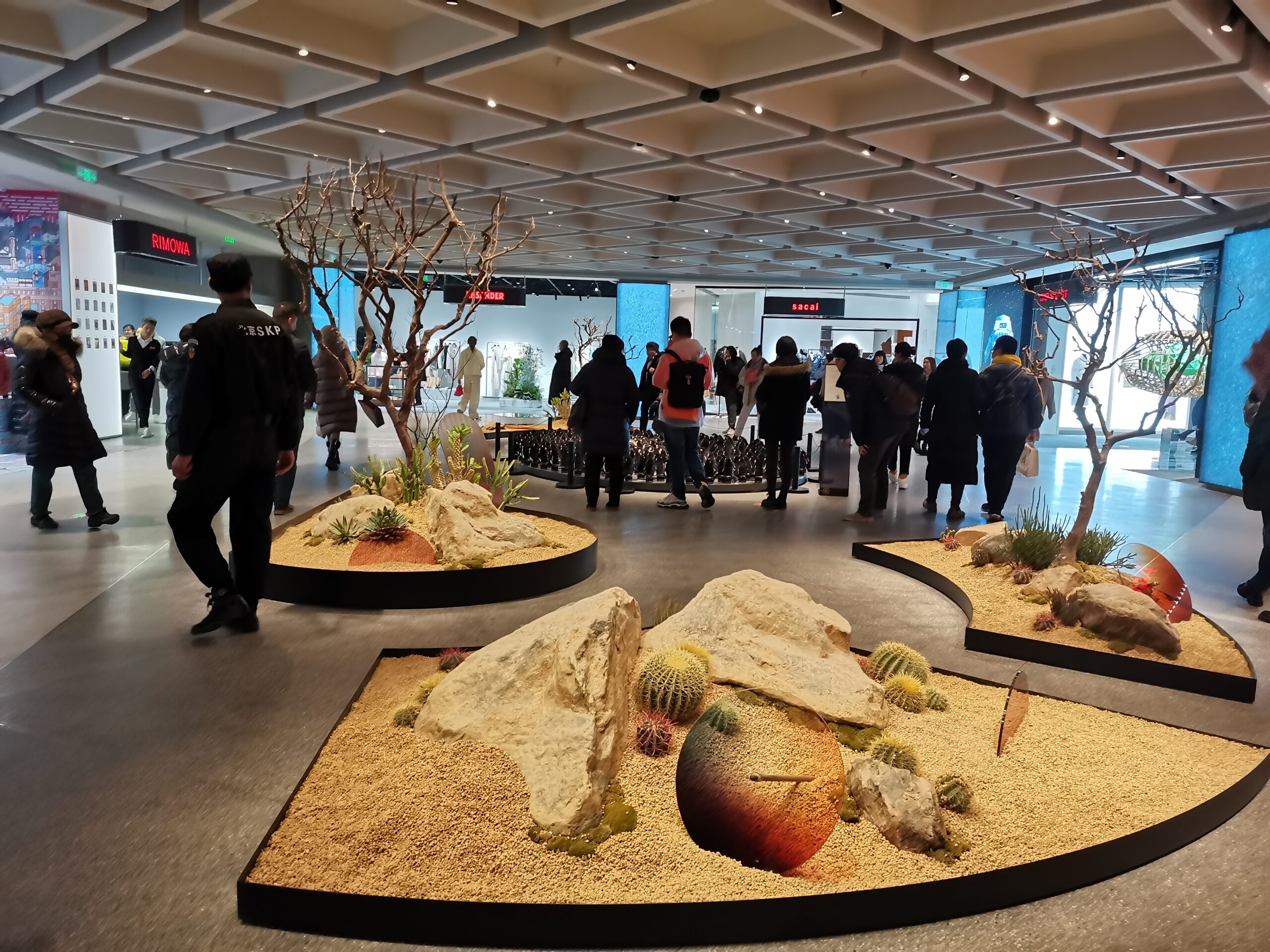
Beijing SKP is consistently ranked among the world’s top luxury department stores, and its lighting is a masterclass in experiential retail. Rather than flooding the floor with brightness, SKP uses a carefully staged lighting hierarchy where architecture, art, and brand each get their own light language. This case study looks at how track lights and downlights shape a high-end shopping environment.
The dominant ambient light sits around 3000–3500K — a hospitality-grade warm white that flatters skin tones and warm materials such as wood, brass, and leather. This warm field makes merchandise feel premium and inviting the moment a customer steps onto the floor.
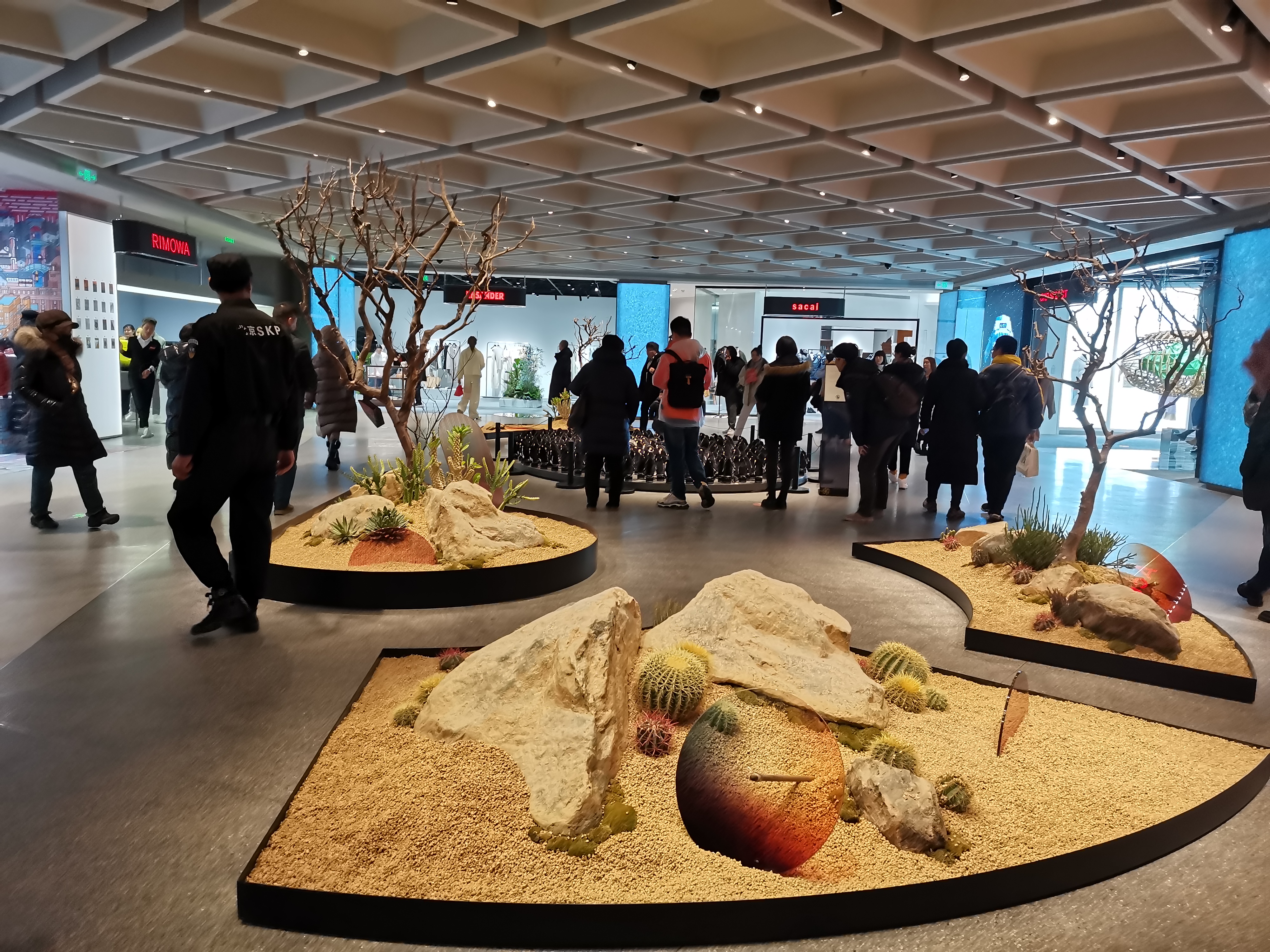
SKP’s signature coffered ceiling hides recessed downlights inside every cell of the grid. The recessed source reduces glare while maintaining high lumen output — a hallmark of Saks/SKP-level design. Cove light along the coffer reveals softens the grid and adds depth.
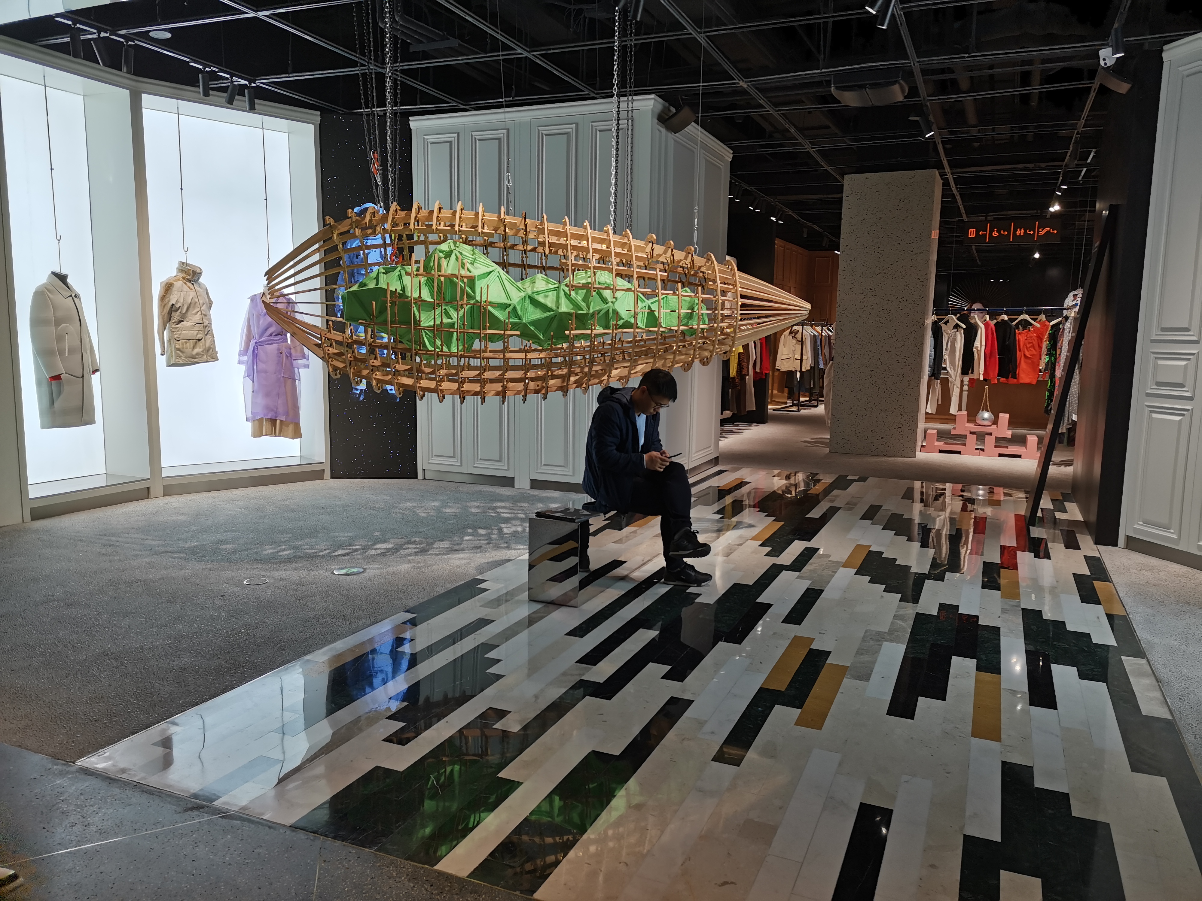
Chromatic light — not just white — zones the space without physical partitions. A cool cyan LED brand wall draws the eye across the hall, while saturated red logo panels act as punctuation. The effect is a three-layer visual priority: warm ambient, cool accent wall, saturated brand mark.
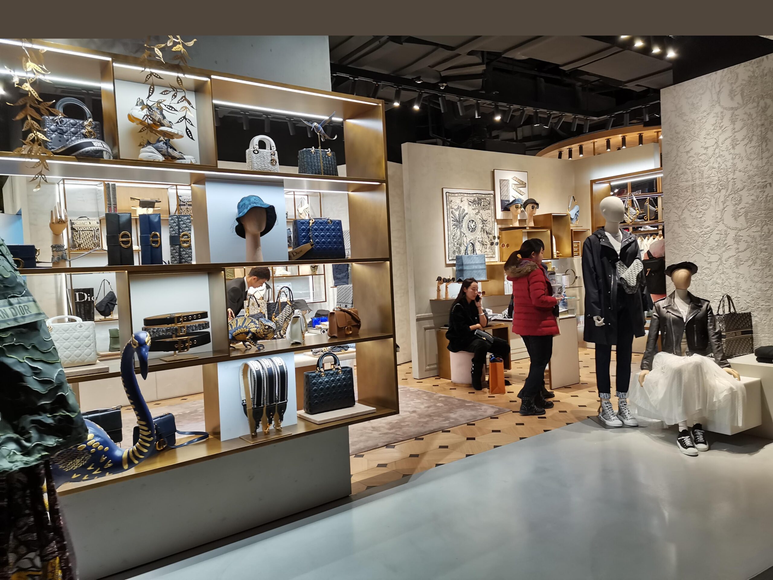
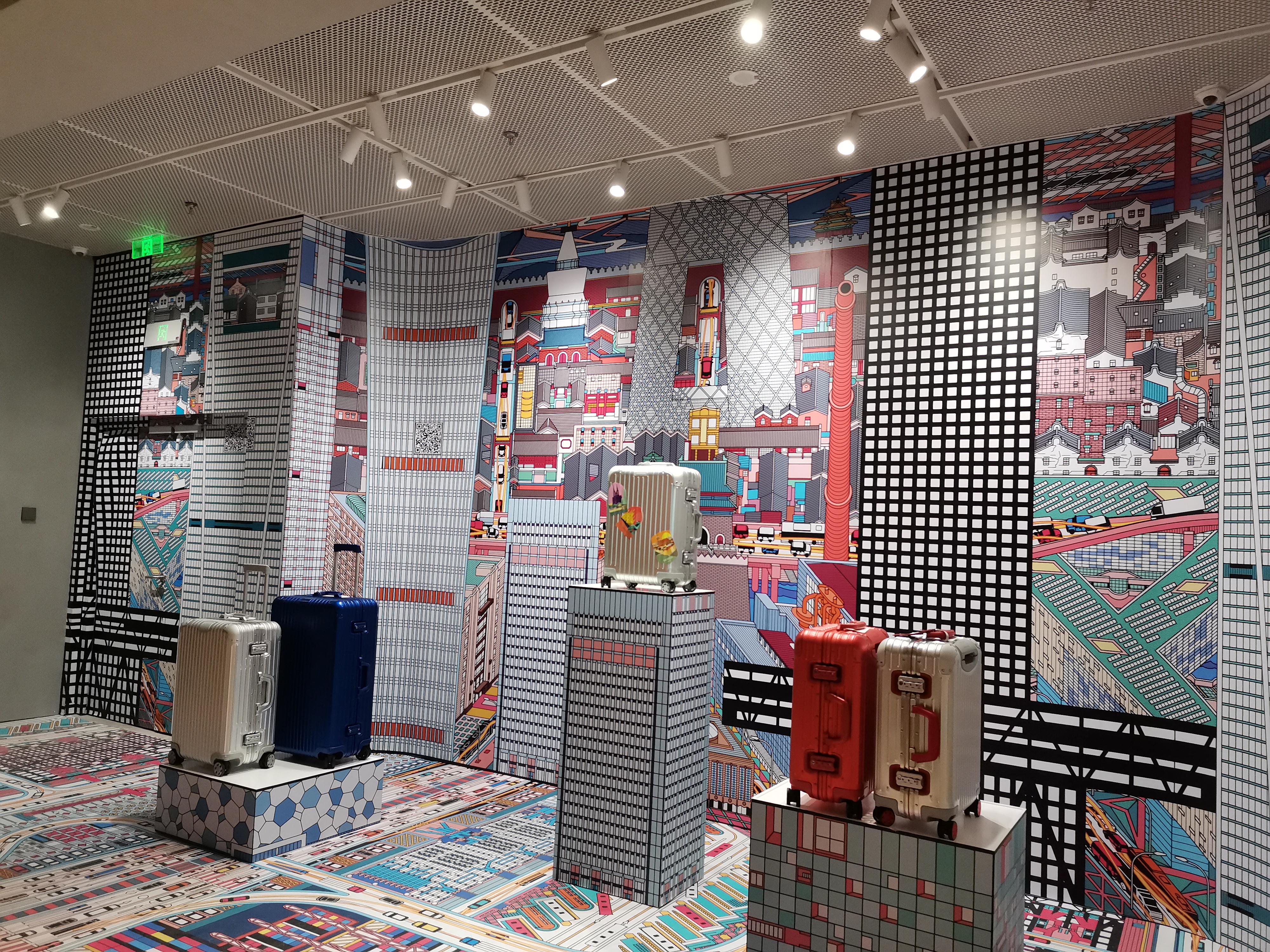
SKP borrows a technique from museum lighting — grazing a biophilic installation to emphasize texture — and uses a polished floor to double perceived brightness through reflection. Storefronts receive higher illuminance than circulation zones, naturally funneling the eye toward merchandise. The result is atmosphere over raw brightness, a convention of fashion floors done at the highest level.
For high-end retail, ENCORE offers glare-controlled downlights, adjustable track lights, and magnetic track systems with CRI 95+ and flicker-free drivers for camera-ready, comfortable spaces. Contact our lighting team to design a hierarchy that sells.
In a luxury department store the lighting budget is not justified by visibility. It is justified by conversion, dwell time, and the perception of value. That reframing changes the entire specification: the question is no longer “is the floor bright enough to read a price tag” but “does this merchandise look worth its price under this light, from the doorway, at a glance.”
Three commercial constraints sit behind every decision on a floor like SKP’s:
Lux levels in retail are usually discussed as if a single number matters. It does not. What the eye reads is the ratio between the display and its surround, and that ratio is what the designer actually controls.
| Zone | Typical illuminance | Ratio to circulation | What it achieves |
|---|---|---|---|
| Circulation / aisle | 150–200 lx | 1 : 1 (baseline) | Safe movement, low visual weight |
| General merchandise | 300–500 lx | 2 : 1 to 3 : 1 | Readable product, comfortable browsing |
| Feature display | 750–1,000 lx | 5 : 1 to 6 : 1 | Pulls the eye across the floor |
| Window / hero | 1,500–3,000 lx | 10 : 1 or higher | Competes with exterior daylight |
The absolute numbers are almost secondary. A floor at a uniform 500 lx will look flatter and cheaper than a floor with 200 lx aisles and 1,000 lx displays, even though the second uses less energy. The hierarchy is the design.
Take a brand bay with a 4.20 m ceiling and merchandise at 1.20 m, served by track heads on a rail 3.00 m above the floor.
That is the arithmetic that turns a mood board into a fixture count. Four 36° heads over four metres give continuous coverage with no dark bands between pools; the same run specified with 24° heads would need six to avoid gaps, and the narrower pools would leave visible scalloping on the joinery between bays.
A coffered ceiling is usually read as an architectural device. Functionally it is an optical one, and SKP exploits it deliberately: every cell of the grid becomes a place to hide a recessed downlight, which removes the source from the visitor’s field of view without sacrificing output.
The glare consequence is significant. A recessed source at 45° cut-off is perceived at a fraction of the luminance of a surface-mounted fixture of the same output, which allows the general layer to run brighter without crossing into discomfort. The practical targets are the familiar ones:
Because a coffer both recesses the source and provides a dark surround, it also increases the apparent contrast of the merchandise beneath it. That perceived contrast is a large part of why the same fixture can look premium in a coffer and unremarkable in a flat plane. Our guide to UGR < 19 covers the classification in detail.
Warm white is the default on a luxury floor for good reasons, and they are physiological as well as aesthetic. At 3000–3500 K the spectrum is weighted toward the red end, which flatters skin tones, deepens timber and leather, and gives brass its characteristic glow. Cool white does the opposite: it flattens warm materials and reads as clinical.
| Merchandise | Preferred CCT | Why | Watch out for |
|---|---|---|---|
| Leather / handbags | 3000 K | Warm grain, natural depth | 4000 K makes tan goods read grey |
| Silk / fashion | 3000–3500 K | Accurate skin and fabric tone | Strong colour cast on white garments |
| Jewellery (yellow gold) | 3000 K, R9 50+ | Gold keeps its saturation | Weak red channel kills the warmth |
| Watches / glass | 3500–4000 K | Specular sparkle reads crisply | Too warm and the sparkle dulls |
| Beauty / cosmetics | 4000 K | Neutral skin, honest colour | Too cool feels clinical |
The pattern is that a single CCT across an entire floor is a compromise, and a large flagship can afford to break the rule per department. Where that is impractical, 3000 K with a strong R9 is the safest single choice because it fails gracefully on the widest range of merchandise.
The layers described above map onto three fixture types. For the accent layer on feature displays and brand walls, the AIMER track light offers a 15–35° optic with CRI 90+ and a usable R9, mounted on the same rail as the wider heads used for general merchandise. For the general layer hidden in a coffer or grid, the ELLA deep anti-glare downlight is designed for exactly that recessed, low-glare role with UGR control. Where a brand wall or backdrop needs even vertical illuminance rather than pools, the ELLA wall washer handles the wash.
Browse the full track light range and downlight range, or read the room-by-room lux guide for the illuminance targets behind the table above.
There is no single figure, because the ratio is what customers perceive. A workable hierarchy is 150–200 lx in aisles, 300–500 lx on general merchandise, 750–1,000 lx on feature displays, and 1,500–3,000 lx in windows. The ratio between display and circulation is what makes merchandise read as premium.
3000K suits leather, timber, brass and fashion because it flatters warm materials and skin tones. 4000K is better for cosmetics, watches and glass where neutral colour matters more than warmth. A large floor can use both by department; if only one is possible, 3000K with a strong R9 is the safer compromise.
Derive it from the pool width. With heads 1.80 m above the merchandise, a 36° optic gives a 1.17 m pool, so four heads cover a 4.00 m run with pools just touching. A 24° optic gives a 0.77 m pool and would need six heads to avoid dark bands between fixtures.
Because the eye adapts to the brightest thing in view. A floor with warm, moderately lit aisles and bright feature displays makes any unshielded source far more noticeable than it would be in a uniformly bright space. Recessing the source in a coffer and keeping UGR at or below 19 solves most of it before any accessory is added.
Yes, if the cells are used to recess and shield the sources. The coffer removes the luminaire from the visitor’s line of sight, which lowers perceived glare, and simultaneously provides a dark surround that increases the apparent contrast of the merchandise below. An unused coffer wastes both effects.
Lighting affects dwell time, the perceived value of merchandise and the ease of evaluating colour — all of which influence purchase decisions. A clear illuminance hierarchy with the correct colour rendering for each department does measurable commercial work that a flat, uniform scheme does not.
The illuminance hierarchy and glare targets used here follow the framework published by the Illuminating Engineering Society (IES); the spectral guidance aligns with the US Department of Energy assessment of LED colour quality metrics.
SKP’s lighting reads as luxurious because it is hierarchical, warm and recessed: a dim circulation layer, brighter merchandise, and feature displays several times brighter again, all in the 3000–3500 K range with enough red content to keep leather and brass convincing. Replicating it is mostly arithmetic — pool width from drop distance, head count from run length, UGR from the coffer — followed by the discipline to keep the ratios rather than raising the whole floor to one comfortable number.
Send us your floor plan and department schedule and we will work through the layers, beam angles and colour specification for your own retail environment.