Address
304 North Cardinal
St. Dorchester Center, MA 02124
Work Hours
Monday to Friday: 7AM - 7PM
Weekend: 10AM - 5PM
Address
304 North Cardinal
St. Dorchester Center, MA 02124
Work Hours
Monday to Friday: 7AM - 7PM
Weekend: 10AM - 5PM

You walk into a boutique and a coat looks rich, deep and true to life. Next door, under cheaper lighting, the same coat looks flat and dull. That difference is the Color Rendering Index (CRI) — and it raises one of the most debated questions in LED specification: does high color rendering really matter? More specifically, when you are choosing between CRI 90 vs 95, is the extra 5 points worth paying for? This guide answers that question head-on, explains what the numbers actually mean, and shows exactly where CRI 95 earns its keep — and where CRI 90 is more than enough.
CRI measures how accurately a light source reveals the true colors of objects compared to a reference light (typically natural daylight). It is scored from 0 to 100, where 100 is a perfect match. The score is built from eight pastel color samples (R1–R8), with a richer extended set (R1–R14) used for rigorous testing. A color rendering index of 90 means the source renders those samples very well; a score of 95 means it renders them almost perfectly.
Here is the key insight most buyers miss: the jump from 80 to 90 is dramatic and easy to see, but the jump from 90 to 95 is subtle and much harder to notice. Below 90, colors start to look muted and skin tones turn sallow. Above 90, the differences become incremental — the sort of refinement that matters in a museum but not in a corridor. Understanding this curve is the foundation of any smart CRI 95 lighting decision.
Both CRI 90 and CRI 95 sit in the “high-CRI” range and are worlds apart from budget CRI 80. The practical gap between them is best understood through the colors that matter most in your space. The table below compares them across the factors that specifiers actually care about.
| Factor | CRI 90 | CRI 95 | Who Should Care |
|---|---|---|---|
| Color accuracy | Excellent, natural colors | Near-perfect, studio-grade | Museums, galleries, photography |
| Skin tones | Natural and flattering | Virtually indistinguishable from daylight | Hospitality, beauty, portrait retail |
| Deep & saturated hues | Vibrant (R9 solid) | Rich and fully saturated | Fashion, art, cosmetics |
| Cost | Moderate premium | Higher premium | Project budget holders |
| Typical applications | Retail, offices, hospitality | Museums, galleries, premium retail | Designers & specifiers |
The 90 to 95 gap is most visible in reds, deep blues, and saturated fabrics. CRI 90 already handles these well, but CRI 95 adds the extra precision that lets a crimson dress stay crimson and an oil painting keep its exact palette. For neutral surfaces and pastels — most walls, concrete, wood — the two ratings look nearly identical. That is why the right answer depends entirely on what you are lighting.
If you light anything where color truth is the product, CRI 95 earns its premium. These are the spaces where paying for the top tier pays off in client satisfaction and perceived quality.
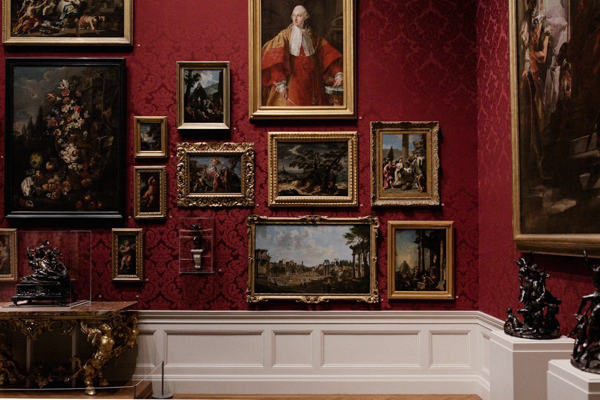
Museum lighting is the single clearest case for CRI 95 lighting. A single point of color rendering can shift how a painter’s original palette reads, and galleries cannot afford even a subtle tint. For exhibitions, conservation-focused fixtures, and display cases, high-CRI track heads at CRI 95 are the industry standard — pairing them with the right beam angle is covered in our museum lighting standards guide.
In fashion and cosmetics, color is the product. A lipstick shade or a silk scarf only sells when it looks exactly right under the light. Premium retailers and beauty counters increasingly specify CRI 95 fixtures to make merchandise irresistible and to reduce returns caused by color mismatch. For a full walkthrough of how color rendering drives retail psychology, see our CRI 80 vs 90 vs 95 comparison.

Wherever a camera captures the scene, CRI 95 matters. A studio light that reads 95 renders fabric texture and makeup tones with the neutrality editors expect, minimizing post-production color work. The same precision benefits product photography for e-commerce.
For most commercial and residential spaces, CRI 90 delivers everything you can visually perceive, and the money is better spent elsewhere — on brightness, beam control, or dimming quality.
In workplaces, lobbies, and general task areas, CRI 90 looks essentially identical to CRI 95 to the human eye. Specifying CRI 95 here adds cost without visible benefit. This is also where pairing high-CRI with the right color temperature matters more than chasing the last few CRI points.
For living rooms, bedrooms, and standard hospitality rooms, CRI 90 produces warm, flattering light that guests and residents perceive as natural. The subtle extra precision of CRI 95 is rarely noticed in these settings, so many designers reserve it for accent and feature lighting only.
A smart specifier knows that CRI alone tells an incomplete story. The R9 value (how well a source renders deep red) is particularly important for skin tones, food, and artwork — and it is not always high just because the overall CRI is. When comparing fixtures, check that high CRI is backed by a strong R9 (often 50 or above for quality sources) rather than assuming a 95 score guarantees perfection across every hue.
For the most demanding color-critical work, also look at R13 (skin-tone rendering) and, where available, the extended R1–R14 suite. Manufacturers who publish these values, such as the high-CRI heads in the AIMER track light range, are usually the ones confident in their color quality. You can verify these claims against authoritative guidance from the Illuminating Engineering Society (IES).

Use this short checklist to settle the CRI 90 vs 95 question for your own project.
For flexible high-CRI coverage, consider fixtures that let you move and aim light exactly where color accuracy matters — CADIO track lights offer adjustable heads, while magnetic track systems let you rearrange accent heads as your displays evolve.
Only in saturated colors such as deep reds and rich blues, and mainly in color-critical settings like galleries, fashion, and photography. In most everyday spaces the two look virtually identical, so CRI 90 is usually the better value.
Yes — but only where color truth matters. Below CRI 90 the drop in quality is obvious and colors look dull. From 90 upward, the returns are incremental, so high color rendering matters most for art, retail, cosmetics, and photography rather than general lighting.
For most commercial and residential track lighting, yes. CRI 90 delivers natural, flattering color and is a solid professional standard. Reserve CRI 95 for accent, display, and color-critical zones.
The 5-point gap mainly improves rendering of saturated reds and deep hues, plus finer skin-tone fidelity. Neutral surfaces and pastels look nearly the same under both ratings, so the real difference shows up on colorful, high-value objects.
Pay for it when color is your product — art, fashion, cosmetics, or photography. Skip it for offices, corridors, and general living spaces, where CRI 90 is visually equivalent and the budget is better spent elsewhere.
So, does high color rendering matter? Absolutely — and the smart answer to CRI 90 vs 95 is: it depends on what you light. Use CRI 95 for art, fashion, cosmetics, and photography, where color truth is the product and every point shows. Use CRI 90 for general commercial and residential spaces, where it delivers natural, beautiful light without the premium. The best projects pair the right CRI with proper beam angles, color temperature, and dimming for a result that feels effortless. Need high-CRI lighting built for your project? Contact our lighting team for a free quote.