Address
304 North Cardinal
St. Dorchester Center, MA 02124
Work Hours
Monday to Friday: 7AM - 7PM
Weekend: 10AM - 5PM
Address
304 North Cardinal
St. Dorchester Center, MA 02124
Work Hours
Monday to Friday: 7AM - 7PM
Weekend: 10AM - 5PM
CRI vs TM-30: what each metric really measures, why CRI can hide a weak red channel, and the Rf, Rg & R9 values to specify for high-CRI LED lights. Read on.
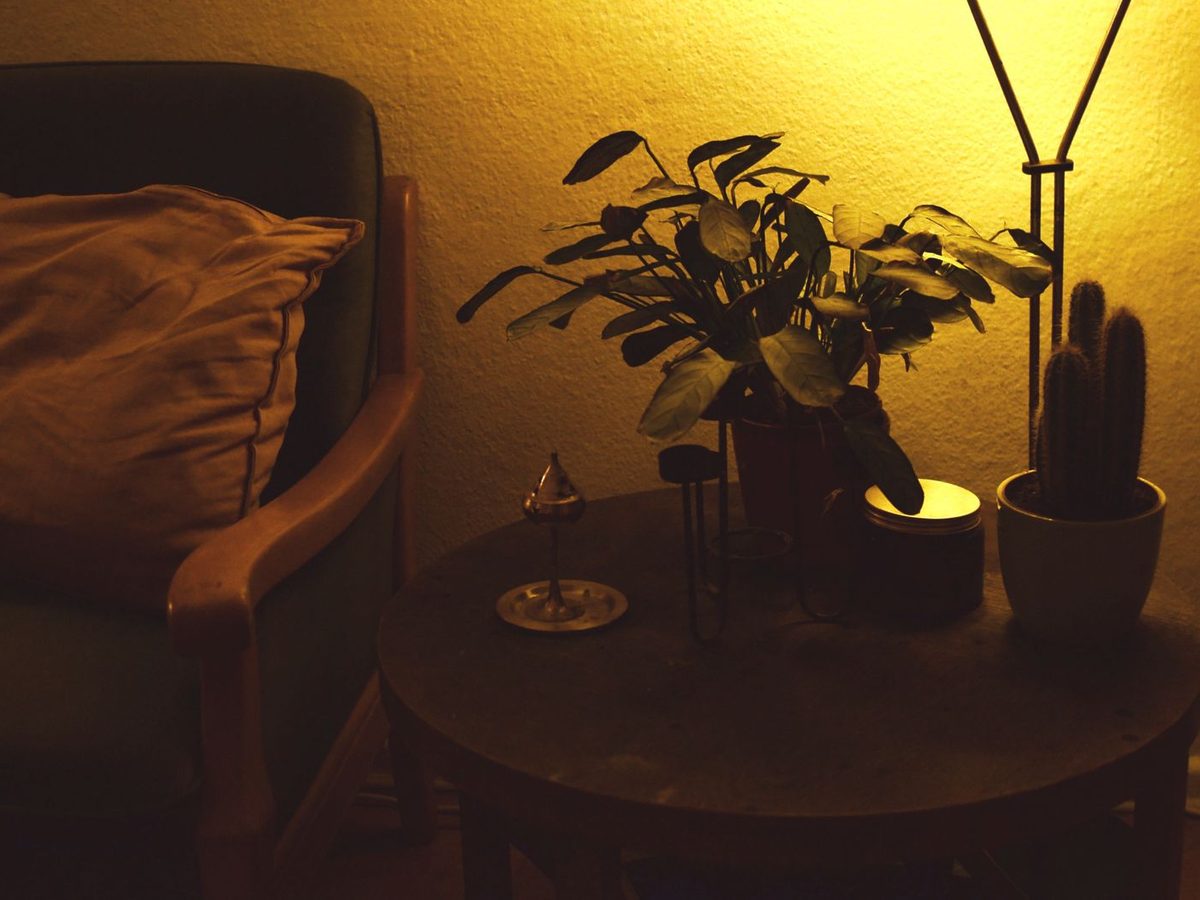
You study a spec sheet, and two numbers look almost identical: CRI 95 versus TM-30 Rf 95. They are not the same thing at all. One is a 1960s-era average built from eight pastel samples; the other is a modern, multi-dimensional system that can tell you whether a light will make your terracotta and rattan look warm or washed out. CRI vs TM-30 is the specification decision that quietly determines how a room actually feels — and if you only quote one of them, you are guessing.
This guide explains what each metric really measures, why CRI can be actively misleading for LED lighting, and exactly what to write on a specification sheet so you get the light you designed. It is written for people lighting real spaces: warm, layered, texture-rich interiors where colour accuracy is not a technicality but the whole point.

The Color Rendering Index was standardised in 1965, when incandescent and fluorescent lamps were the only real options. It works by comparing a test light source against a reference source of the same colour temperature, using eight muted pastel samples labelled R1 to R8. The average of those eight scores becomes the single number everyone quotes: the general colour rendering index, or Ra.
A score of 100 means a perfect match to the reference. A score of 80 means the colours are noticeably duller. That is the whole system — one number, eight colours, one average.
The first problem is that a muted reference palette means CRI simply does not test the colours people care about most. Deep reds, saturated oranges, wood tones, skin undertones and terracotta are largely absent from R1–R8. A light can score a respectable CRI 90 while rendering saturated reds poorly.
The second problem is averaging. Because Ra is a mean, a light can fail badly on one or two samples and still produce a high overall score. A severe weakness in red is mathematically diluted by seven stronger scores, and the single number hides it completely.
The third problem is the reference itself. CRI is anchored to an incandescent-like spectrum. Modern LED emitters achieve colour by adding phosphor to a blue pump, and their spectra are spikier and less smooth. That is precisely why CRI was never designed to describe them, and why two LED fixtures with identical CRI 90 can look dramatically different in a real room.
There is also a well-known blind spot: R9. The ninth sample, saturated red, is excluded from the Ra average. R9 goes negative on poor LED sources. A fixture can advertise CRI 90 and still render your hand-carved teak, your dried florals or a bowl of persimmons as flat and lifeless. If a datasheet does not publish R9, assume it is not good.
TM-30 was developed by the Illuminating Engineering Society as a complete replacement framework for evaluating colour rendition. It is published as ANSI/IES TM-30, and the U.S. Department of Energy publishes a detailed TM-30 FAQ and tutorial explaining how it works.
The core difference is scale. CRI tests 8 muted samples. TM-30 tests 99 real-world colour samples drawn from natural objects: skin tones, foliage, textiles, ceramics, food and wood. Instead of one score, it returns several independent measurements that describe different aspects of colour behaviour.
Rf is the closest cousin to CRI. It reports how closely the test source reproduces the 99 samples compared with a reference. It runs from 0 to 100, where 100 is perfect. A light with Rf 95 renders colours very faithfully; a light with Rf 78 will produce visible colour shifts.
Rg is the metric CRI has no equivalent for, and it is the reason designers love TM-30. It describes the volume of colour a source can produce. An Rg of 100 means the source matches the reference exactly. An Rg below 100 means colours are muted and duller than reality. An Rg above 100 means colours are pushed and more saturated than reality — warmer, richer, more vivid.
This is the subtlety that changes how a room feels. Two fixtures can both have Rf 95, yet one at Rg 88 makes a boho living room look dusty and flat, while one at Rg 103 makes rattan, clay and worn leather glow. Fidelity tells you the colours are correct. Gamut tells you whether the room feels alive. This is the same principle that makes warm, texture-rich interiors read as inviting rather than tired — which is why high colour rendering matters more than most buyers expect.
TM-30 also publishes R9 as part of a 16-hue-sample set called Rf,hj, and generates colour vector graphics that show exactly which hue regions a source weakens or strengthens. Instead of guessing from an average, you can see that a particular fixture pulls red and orange forward while leaving cyan slightly flat. For a designer, that is an instruction manual; a single CRI number is a rumour.
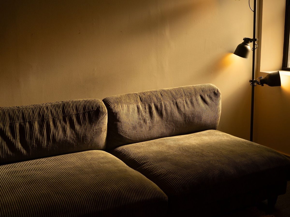
There is a reason serious lighting specifiers talk about colour metrics far more than most homeowners do: the interiors with the most visual richness are the ones most easily ruined by a mediocre light source.
A warm, layered scheme is built almost entirely from saturated mid-tones: rust and brick, mustard and ochre, olive and sage, caramel and terracotta. These sit in the red-to-yellow region of the spectrum — the precise region that R1–R8 handles poorly and that R9 covers instead. Under a fixture with a weak red channel, a vibrant rust throw looks muddy, and a hand-thrown clay vase turns grey-brown. Nothing is technically broken; the light is simply lying about the colours.
Rattan, jute, raw linen, unglazed ceramic, dried grasses, leather and unfinished timber are all low-saturation, high-texture materials. They have very little colour contrast of their own, so they depend entirely on the light to reveal form. A light source with poor spectral continuity flattens that texture into a single beige smear. A source with good Rf and an Rg slightly above 100 makes every weave and grain read cleanly. This is why designers working with natural materials should pair colour metrics with the right beam angle — the optics determine how the light grazes the texture, and the phosphor determines whether the colour survives.
A layered scheme typically uses three or four light sources at once: an ambient wash, a task layer, and two or three accent sources. If those fixtures have inconsistent spectra, the same wall changes colour as you move across the room. In a room that relies on warm, soft gradients, that inconsistency is far more visible than it would be in a flat, neutral office scheme. Matching the colour metrics across all the fixtures in a space matters as much as matching the colour temperature.
The table below sets the two systems side by side across the factors a specifier actually needs to weigh.
| Factor | CRI (Ra) | TM-30 (Rf / Rg) |
|---|---|---|
| Origin | CIE 13.3, 1965 (originally for fluorescent lamps) | ANSI/IES TM-30, developed for modern LED sources |
| Test samples | 8 muted pastel swatches (R1–R8) | 99 real-object samples (skin, foliage, textiles, wood, food) |
| Output | One averaged number, 0–100 | Rf and Rg plus 16 hue-bin scores and vector graphics |
| Saturated red | Excluded from the average (reported separately as R9) | Included in the sample set and reported by hue bin |
| Saturation behaviour | Not measured at all | Measured directly and reported as Rg |
| Typical LED scores | Ra 80–98 | Rf 70–97, Rg 85–105 |
| Best use | Legacy compliance, quick comparison between similar fixtures | Specifying real spaces, especially saturated and textured interiors |
| Weakness | Hides red weakness and rewards smooth, incandescent-like spectra | Requires two numbers instead of one; less familiar to non-specialists |
The practical reading is simple. CRI is a pass or fail filter: does this fixture clear the bar at all? TM-30 is the design tool: which way does its colour character lean, and is that the direction my room needs?
You do not need to run calculations. You need three habits.
Rf alone is a partial answer. A fixture quoting Rf 96 with Rg 88 renders colours accurately but slightly desaturated — technically excellent, atmospherically cool. A fixture quoting Rf 92 with Rg 103 renders colours truthfully and pushes them a fraction warmer and richer. Neither is better in the abstract; one is better for the room. If a supplier publishes only Rf, that is a signal they are treating TM-30 as a marketing badge.
For any space with wood, leather, clay, warm textiles or food, R9 is the single most diagnostic number on the datasheet. Look for R9 above 50 as a floor for commercial work, and above 80 for residential, hospitality and retail spaces where colour is the point. Below 50, saturated reds and skin tones will look dull and slightly grey.
Have your supplier quote every fixture in the project with the same metric set — ideally Rf, Rg and R9 for each. If the accent spots are Rf 92 / Rg 102 and the task linear is Rf 82 / Rg 92, the same natural materials will read differently under each. Consistency is the specification, not the peak number.
Here is a specification clause you can hand to a supplier directly. It works whether the project is one living room or a hotel rollout.
That clause takes two minutes to write and eliminates the most common cause of a beautifully detailed interior looking disappointing on handover.
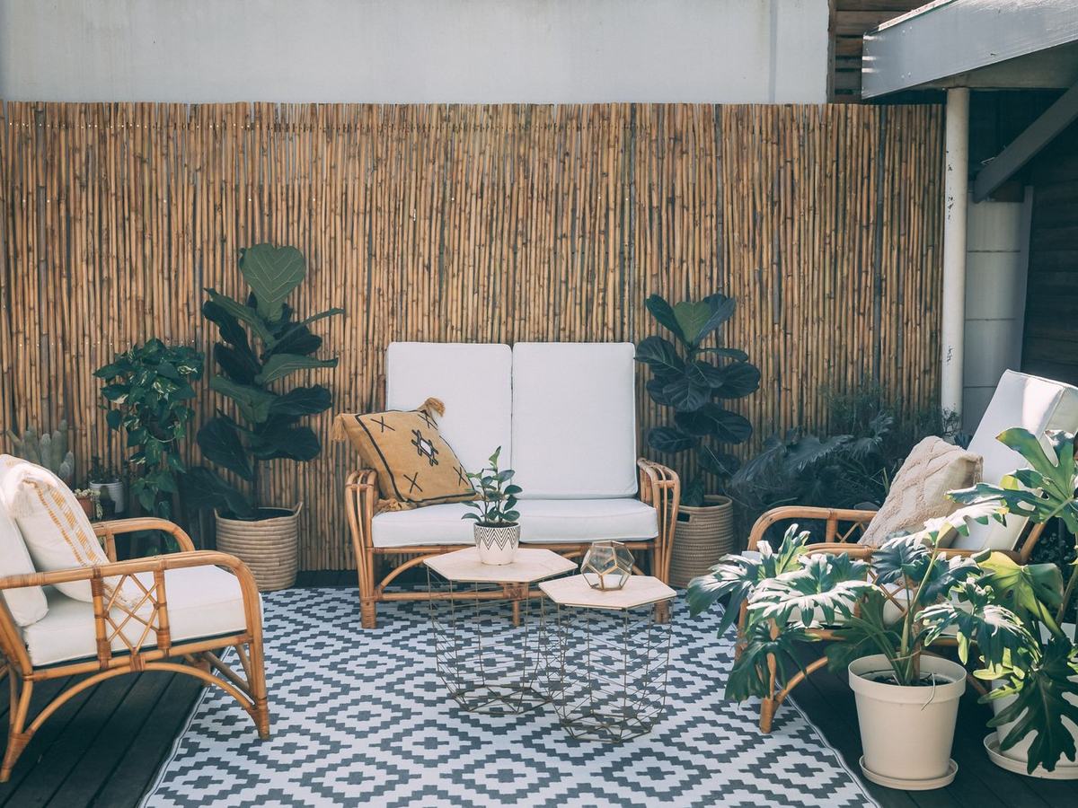
Colour metrics are not abstract. They show up in specific rooms, on specific materials.
An ambient layer of anti-glare downlights sets the background. Because it covers the whole space, its Rf and Rg shape every material in the room at once. Pair a high-fidelity downlight with wall washers to lift the vertical surfaces, and the warm palette holds from floor to ceiling instead of dying at the walls.
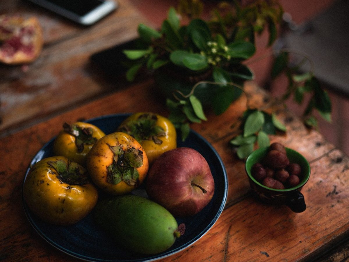
There is no harsher colour test than a bowl of citrus, persimmons and red apples on a wooden table. It combines saturated red and orange, glossy skin and matte timber in one small area — exactly the combination that exposes a weak red channel. This is where adjustable track heads earn their place: you can aim a narrow beam precisely at the table and choose fixtures with R9 above 80, so the food looks as good as it tastes.
Books, magazines and printed matter are a subtle but unforgiving test. Poor spectral continuity makes white paper read faintly yellow-green rather than neutral. A task light with a balanced spectrum keeps paper clean while keeping the warm ambient layer intact.
Bedrooms are dominated by matte, low-saturation textiles — linen, cotton, wool, jute. Their entire visual appeal is texture, and texture depends on spectral quality. A fixture with Rf 90 / Rg 100 makes rumpled linen look soft and dimensional; Rf 80 / Rg 90 makes it look like flat grey fabric.

TM-30 is more accurate and more informative, and it was designed specifically for the LED sources used today. It reports fidelity (Rf), saturation behaviour (Rg), red rendering and per-hue performance instead of one averaged number. CRI remains useful as a quick legacy comparison, but it should not be the deciding metric on a modern LED specification.
Rf 90 or above is considered good for residential and hospitality lighting, while Rf 95 or above is expected in galleries, museums, fashion retail and any setting where colour accuracy is critical. Below Rf 85, colour shifts become clearly visible on saturated and natural materials.
Rg above 100 means the light source reproduces colours with slightly more saturation than the reference. This is often desirable in warm residential interiors, where it makes wood, clay and textiles look richer. Rg below 100 means colours appear muted and duller than reality. Neither is a defect on its own, but the direction should be a deliberate choice.
Yes, and it is common. Because CRI averages only eight muted pastel samples and excludes saturated red from that average, an LED fixture can score CRI 90 or higher while delivering an R9 close to zero and a visibly desaturated red region. This is the classic case where a CRI-only specification hides a weak fixture.
Specify ANSI/IES TM-30 as the primary metric, quoting both Rf and Rg at the target colour temperature, add a minimum R9, and ask for CRI only as secondary legacy information. Also require that all fixtures in the same visual space come from the same LED bin so the colour behaviour is consistent.
CRI vs TM-30 is not a fair fight: one is a 1965 average built from eight pastel swatches, the other is a modern system built from 99 real objects with separate measures for fidelity, gamut and red rendering. For any interior where colour is part of the design — especially warm, textured schemes full of rattan, clay, linen and timber — TM-30 is the metric to specify. Quote Rf and Rg together, insist on a published R9, and keep every fixture in the room within a few points of each other.
When you are ready to specify light that renders your materials the way you designed them, explore the high colour rendering track lights and low-glare downlights from Encore Lume, and see how our beam angle guide helps you layer them. Need datasheets with Rf, Rg and R9 published for every model? Talk to our lighting team and we will send the full photometric set for your project.